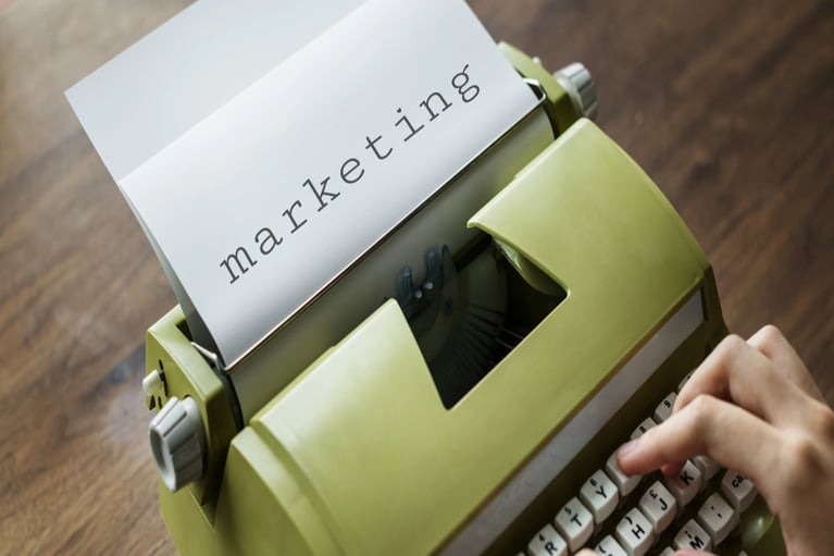
Marketing Emails That Get Results
“You’ve got mail!” Remember when getting an email was exciting? Now our inboxes are stuffed full. How can you make your marketing email be the one that gets noticed—opened—and clicked through?
With all the ways to reach customers, marketing emails are still one of the most popular methods. You can sort and target, measure response rates, and enjoy a high ROI with an up to 4400% return rate. But just because an email is easy to send doesn’t mean it will have value to your customers and lead them to the next step you want them to take.
Let’s look at a few real samples of marketing emails (with identifying details obscured) to learn some best practices of effective marketing emails.
The Short and Sweet
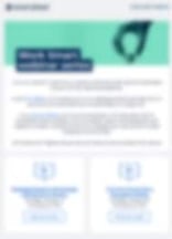 This email has many great things going for it:
- The product name is prominently featured at the top.
- There’s a relevant image and an easy-to-scan email title.
- They’ve used enough copy to explain what’s important without overwhelming the reader.
- While one call to action (CTA) might be enough for your needs, this email employs two, which works because they are clear and prominent at the bottom.
This email says “read me” in everything from its simple and uncluttered design to its calming color scheme.
The Storyteller
So you hooked your reader’s attention with your subject line and got them to open your email. First impressions are critical. What do you think their response will be with this email? 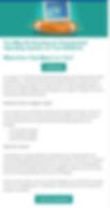
- The image is working. It appears to be a custom illustration that supports the message.
- The title looks a little long, but it probably still works.
- A CTA button directly underneath the title is a good idea so your reader knows exactly what you want them to do.
- Bullets are a great way to chunk information. But—before you write all that copy—ask yourself if you really need it all in an email. Can you tease here instead and give more details on a landing page?
It’s easy to drift into storytelling mode, but the point of your email is to get the click, not to be an entire article that satisfies your reader without them taking action.
A really effective way to keep your copy succinct, relevant, and engaging is to use “one weird old trick” from the 1930s, a sales psychology pattern called Monroe’s Motivational Sequence. You can follow this to create one paragraph or less of copy that hooks your readers and drives them to want more.
Choose Your Own Adventure
In comparison to the previous email that was text-heavy, this one is all about visually chunked content. This organization has lots of things they want to draw attention to. 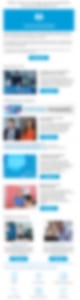
- The setup is a short preface with an overall CTA so the reader knows what to do before they even start scanning and scrolling.
- This has lots of options to click, but the reader may enjoy having several ways to discover more.
- While many CTAs could quickly create clutter, it works here because the email is laid out in a visually pleasing way—following a pattern of matching thumbnails, a short amount of copy, and a button of the same size and color for each item.
Readers can easily scroll and scan this email to find what’s of interest and click to find out more about each feature. If you have several paths that are all acceptable, or you can tie several CTAs to one landing page, this format is a great way to go.
Sometimes we have a lot of places we want our readers to visit. While it’s OK to provide a few options, if you give too many, you can shut down your reader, as we see with the last email.
For the Love of Pete
When your reader is paralyzed from the moment they open the email … it’s a very bad thing.
![]()
- The sheer length of this is overwhelming. (Imagine this little image expanded to fill your email client or browser window. Even worse—imagine it on a phone. Talk about an endless scroll.)
- While this email doesn’t have much text, that doesn’t mean it’s better than one that’s text–heavy, because the visual elements are so over the top.
- Too many colors and shapes of all sizes are vying for attention. A unified design scheme for layout and color would be much kinder to the reader’s eye.
- This email would be 1000% improved by pulling out a few of the most important topics and presenting them as thumbnails, then directing readers to a landing page to find out details instead of including them all here.
Using Best Practices = Best Results
For the most effective marketing emails, you need to use best practices to help you get the highest return rates. Start with an intriguing hook in your subject line. Create a strong hero image that ties to your title and content. Keep the copy short, engaging, and compelling. Use good design that visually appeals as well as propels your reader to action. Include easy-to-find CTAs, and if you have multiple CTAs, chunk your content in a visually appealing way.
For something as short and simple as a little marketing email, all this is a lot to keep in mind. At McKinnon-Mulherin, we are experts in crafting concise, persuasive marketing copy that engages your readers and drives clicks and leads. We can even consult with you and your creative team to provide suggestions for a cohesive asset with strong images and layout. Reach out to learn how we can take emails or other marketing assets off your plate so you can get back to creating brilliant campaigns.
About the Author: Jennifer Hughes