You Did That in PowerPoint?
A case study in effective PowerPoint animation
We tend to think of presentations created in PowerPoint as downright boring—made with static images or over-the-top, goofy animations that distract from the message. It doesn’t have to be that way, though. When PowerPoint’s animation tools are used with solid design principles, they can spice up otherwise boring information, making presentations more visually engaging and effective, as shown in this case study example.
Background
Our client, who works in the pharmaceutical industry, needed a PowerPoint to play on loop during a conference. The PowerPoint, adapted from an infographic, followed a patient’s journey through a procedure spanning multiple years and steps, and then showed charts and graphs about how a medication helped the patient through their journey.
Problem
Our client’s end client was unhappy with the way the PowerPoint was built. While there was important insight in the content, the presentation itself was suffering from some common PowerPoint woes. Each slide had too much information, which prevented people passing by from easily absorbing the message, and it wasn’t very exciting. Our client needed help getting his powerful message across in a way that popped.
Solution
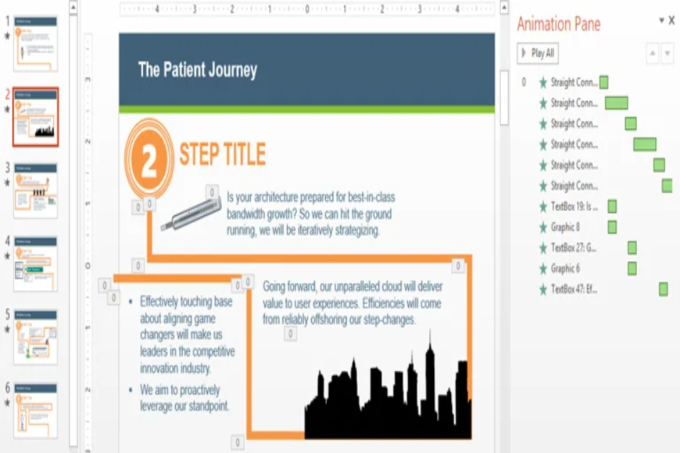
Instead of showing the patient journey all at once on a crowded slide, we wanted to guide the audience through each step.
To start, we separated the steps of the patient journey into distinct parts. Using graphic elements to match the look of the original patient journey infographic, we put one step on each slide with a large step number. To show that the patient was making progress, we connected each piece of text or clip art with thick, orange lines and animated the lines to give the impression that the path was being drawn in real time, with each piece of information popping up along the path as the line reached it. The timing of these animations was a crucial factor to keep everything running smoothly. We also added transitions between each slide to make the slide changes more eye-catching and to continue the sense of progress and movement through the journey.
The result was a presentation that flowed seamlessly from step to step, with little doubt about what the information was, or where it fell along the journey. We repurposed existing graphics to balance the visual and textual elements of the presentation and used bright colors to make the animations pop. We were careful not to get too wild. It’s easy to add lots of flashing lights and exploding clip art, so we stuck to animations that made the message stronger, were consistently timed, and didn’t distract from the content. Our client was still the expert, but now his message was stronger and easier to understand.
The product? A seriously cool PowerPoint and a satisfied client.
Conclusion
Contrary to popular belief, you really can build cool and professional presentations in PowerPoint. With powerful, built-in animation tools, you can effectively transform your information into an interesting and visually arresting presentation. If the thought of doing that yourself scares you, reach out and we’ll help you put some life back into your boring PowerPoint.
Click the video window below to view a sample of the presentation we made for our client.
About the Author: Paige Frame